Color contrast is an essential tool when painting. It creates a striking image on the canvas, delineating between two distinct elements. With proper use, you can use color contrast to focus attention on a key element or feature stunning colors.
However, color contrast is more complicated than simply placing two contrasting colors next to one another. There are actually three different types of color contrast. Learn more below:
Value Contrast
Value is how light or dark an element is on a scale of white to black. Value contrast, then, refers to the contrast between light and dark colors. For example, yellow is lighter on the value scale than green. So, if you placed yellow and green next to one another, there would be a value contrast.
Hue Contrast
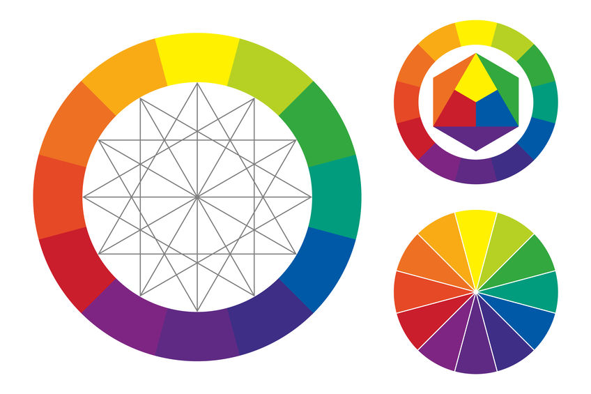
Hue contrast is what most people think of when they imagine contrast. It refers to the contrast between different colors on the color wheel. Complementary colors (colors on opposing sides of the color wheel) have strong contrast. So, for example, yellow and blue are on opposite ends of the color wheel. As such, they have strong hue contrast.
Saturation Contrast
Finally, there’s saturation contrast. This type refers to contrast between saturated and dull colors. For instance, there will be a sharp saturation contrast between a saturated orange and a dull orange. They may be the same hue, but their saturation differs significantly.
Understanding the different types of color contrast can help you on your journey of becoming a great artist. At Creative Ventures Gallery, we also have plenty of classes and workshops to further you along on this journey. Contact us today to learn more!